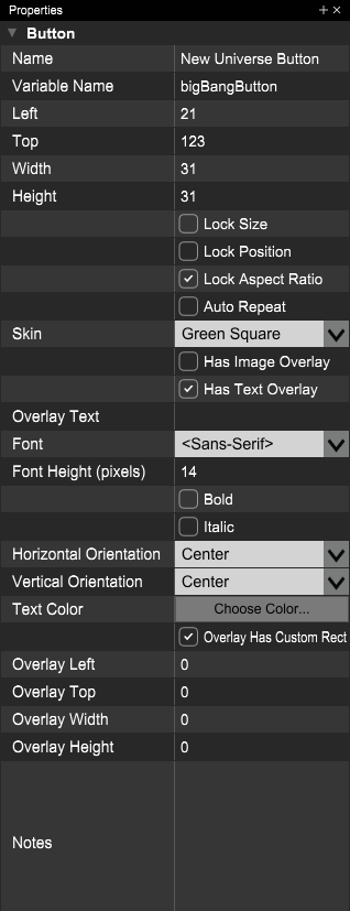
“Button” controls are conventional push buttons that depress when you click on them and return to their unpressed states when you stop clicking on them. If you want a button that stays down after you stop clicking (and possibly one that’s part of a set of radio buttons), use the “Toggle Button” control instead. While toggle buttons are great for showing state, regular buttons are better options if you want to start an action - play or stop buttons, for instance.
Java Class Name: VoltageButton
Notifications:
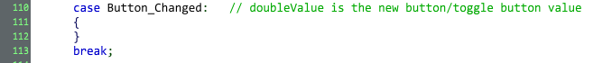
A Button_Changed notification will arrive in Notify() whenever a button gets pressed or unpressed:
Save/Restore State: Voltage Modular doesn’t save or restore the states of regular buttons when users save presets. If your button has some custom state - maybe you’ve called SetValue(1) to set it permanently down (though you probably want a toggle button instead if this is the case) or you’re using button presses to cycle through a series of states - you’ll need to save the state in internal variables and add code to GetStateInformation() and SetStateInformation() to save/restore.
Auto Repeat: If checked, holding down the button will send out continuous button up & button down notifications at a regular interval. We added this so that we could put up & down buttons next to digital counter controls and continuously increment or decrement the counters by holding one of the arrow buttons down (in a case like this, you’d increment the counter’s value each time you received a button-down notification).
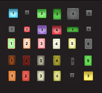
Has Image Overlay: If checked, you can select an image that will display on top of the button, such as a ‘play’ or ‘stop’ icon. The module designer comes with a variety of overlays (all the overlays that are used in any of Cherry Audio’s modules, basically), and it will also add to the “Image Overlay” dropdown any image files that you copy to the user overlays folder (requires version 1.06 or higher). On Windows, this folder will be [my documents]\\Voltage Module Designer\\Resources\\Overlays . On the Mac, this will be Documents/Voltage Module Designer/Resources/Overlays.
Image Overlay: The dropdown that lets you select an image overlay for the button (only visible if “Has Image Overlay” is checked.
Overlay Has Custom Rect: By default, image and text overlays will occupy a bounding rectangle the size of the button. Image overlays will get centered within that rectangle and text overlays will get aligned within that rectangle according to the text orientation settings. If you want to position the image or text in a particular location on top of the button, you can specify a custom rectangle in which the overlay will display. For image overlays, this can also result in reducing the size at which the overlay displays, depending on how much smaller than the original button you make the overlay’s custom rectangle.
Overlay Left, Top, Width, and Height: If you’ve enabled a custom rectangle for an overlay, these settings will size and position that rectangle relative to the button’s upper left corner.
Preserve Overlay Image Aspect Ratio: If the button has an image overlay and this option is checked, the image overlay’s original aspect ratio will always be preserved when it gets resized to fit on the button. If unchecked, the overlay image could get stretched or squashed.
Has Text Overlay: If checked, you can add text to display on the button.
Overlay Text: The text to display on the button when you’ve checked the “Has Text Overlay: option.
Font, Font Height (pixels), Bold, Italic, and Text Color: If you’ve checked the “Has Text Overlay” option, these controls will let you edit the basic properties of your text overlay’s appearance.
Horizontal and Vertical Orientation: specifies alignment for the text in a text overlay, either within a custom overlay rectangle, if you’ve specified one of those, or within the entire button if you haven’t.