The Skin Editor Dialog lets you create your own skins for the module designer’s various control types. Once you’ve created a skin and saved it, it’ll appear in the “Skin” dropdown for that control type along with all the presupplied skin types.
We highly recommend that you use SVG files for your skins so that they’ll scale to any size without aliasing.
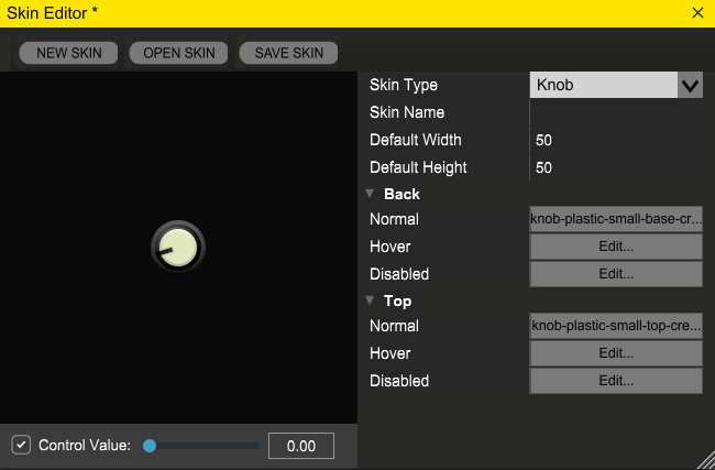
New Skin, Open Skin, and Save Skin Buttons: These allow you to save your skins and open existing skin projects. On Windows, your skins will get saved in Documents\Voltage Module Designer\Resources\Skins, On Mac (version 1.06 and higher) they’ll get saved in Documents/Voltage Module Designer/Resources/Skins. The skin editor will copy any source image files it needs to the save folder, so you don’t need to keep copies of them in their original locations in order for the skin to keep working.
Control Value: This allows you to emulate SetValue() calls to LED and VU meter skins so you can see how your skin looks throughout its range. This control will also work on knob and slider skins, though you can just click on the knobs and sliders themselves, and will even work on button and switch skins in the unlikely event you want to use a slider to turn them on and off. For other kinds of control skins, it’ll have no meaningful effect (technically, you can use it to count from 0 to 1 on a digital counter).
Skin Type: The module designer currently supports user skins for audio and MIDI jacks, regular and toggle buttons, knobs, horizontal and vertical sliders, digital counters, LEDs, switches, and VU meters.
Skin Name: This is the name your skin will have in the property panel’s “Skins” dropdown.
Default Width and Height: When you set a control to use this skin, the control will automatically get reset to this size if you don’t have its “Lock Size” option set.
STANDARD ART STATES:
Normal: used when a given control is enabled and the user isn’t interacting with it in any way (clicking on it or hovering the mouse over it being the most common sorts of interactions).
Hover: used when the mouse is hovering over a given control.
Pushed: used when the mouse is pushed down over a given control.
Disabled: used when the control is disabled. The disabled state is currently only used for audio and MIDI jacks, but will probably get added for other kinds of controls in an upcoming release.
Control Types: