The basic steps for creating a module are:
Setting the basic parameters for a module, including module name, Java class name,
Package Name, module width, etc.
Choosing a background graphic, known as a “skin”, for the module.
Placing controls, such as jacks, knobs, buttons, text labels, etc. onto the module.
Writing the Java code for the module to hook up all the controls.
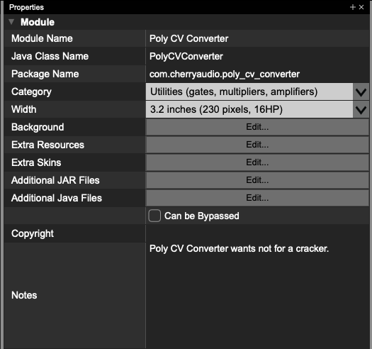
To configure the basic properties of a module, click on the background of a module and you will
see the Module Properties in the Properties Pane. (If you don’t see the Properties Pane, click
View->Properties Pane to ensure that it is visible.)
Module Name
This is the full name of the module. The module will be listed in a user’s module library and in
the Voltage Module Store with this name.
Java Class Name
This is the name of the main Java class for your module project. It must be a valid Java class
name, and cannot contain any spaces. Because, in this example, the class is named
PolyCVConverter, the first line of the class will read:
Public class PolyCVConverter extended VoltageModule
Package Name
This is the name of the unique package that this specific module belongs to. The package for every module you create should be unique. Package names can only contain numbers, periods, underscores, and lower-case letters. Java package naming conventions can be found
here
.
Manufacturer
This should be your name, or the name of your company. Modules will be listed in a user’s
module library and in the Voltage Module Store with this manufacturer name.
Type of Module
This allows you to choose one of five main categories for your module. The categories are:
Sources - oscillators, noise generators, percussion modules, etc.
Processors - filters, wave shapers, etc.
Controllers - envelope generators, sequencers, keyboards, MIDI-to-CV, etc.
Effects - reverb, delay, phaser, chorus, etc.
Utilities - mixers, gates, multipliers, amplifiers, etc.
It is very important that you select the best category for your module. Modules will be listed in a
user’s module library and in the Voltage Module Store with this selection. In addition, choosing
the correct module type helps Voltage mix audio in the most efficient manner.
Width & Height
Voltage modules are sized according the the Eurorack specification. Eurorack modules are all
128.5 millimeters high, or approximately 5” high. The width of a module is measured in units
called Horizontal Pitch, or HP. One HP is .2” wide. Voltage module sizes are always in integer
units of HP. The Width dropdown will allow you to select the width in inches, and it will also
show you the size in HP and in pixels.
The module shown is 3.2 inches wide, which is 16 HP. At 100% zoom, the module will be 230
pixels wide by 360 pixels high. You can use these dimensions to create custom background art
for your module.
Background
This launches a dialog that lets you select your module’s background. It can be either a solid
color or an image file.
Extra Resources
This lets you embed additional resources (such as audio files in a sampling module, to name
one likely example) in your module. Use the
GetBinaryResource() function to obtain ByteBuffers
resources you’ve added to the Extra Resources section.
Additional Java and JAR Files
These allow you to add extra Java and JAR files to your project. Any extra Java files you add
can be edited in the module designer’s code editor.
Copyright
This field allows you to declare a copyright statement that will be embedded in your published
module.
Notes
You can use this field to store any notes about this module. These notes won’t be added to your
published module; they’re there strictly for your benefit.
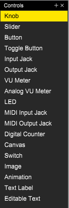
Placing Controls
To place controls onto your module, make sure that the Controls Pane is visible. If it isn’t, click
View->Controls Pane to show the pane.
On the Controls Pane, you will see a list of various controls that can be added to a module.
Adding these controls is as simple as dragging and dropping them onto your module.
For example, to add a knob to your module, simply click on the “Knob” text and drag the control
onto your module. When you release the mouse button, a knob will be created on your module.
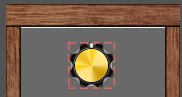
The red outline indicates that this control is currently selected. To resize the control, click on the
red outline and drag in any direction. Note that some controls, such as jacks, cannot be resized,
and other controls, such as knobs, will always have a fixed ratio of width to height. Controls in
Voltage use vector graphics, so it is safe to resize them to any size that you want.
When a control is selected, the control’s properties will be shown in the Properties Pane.
Every control will have the following properties:
Name
This is the visible name of the control. It is important to name every control well, because these
names are often visible to the user. For example, a volume control should be given a
descriptive name, such as “Master Volume”. Note that every control name must be unique.
In addition, once you have published your module, you should not change the control
names, as they are used to save & restore the settings of a module. So please take care to
name every control well from the start.
Variable Name
Every control is represented by a variable in the Java code. To make programming easier, it is
recommended that you give controls a descriptive variable name. For example, a volume
control might be given a variable name of volumeKnob. A variable will be automatically created
for each control. It will look like this:
private VoltageKnob volumeKnob;
Left
This is the X position of the control on the module.
Top
This is the Y position of the control on the module.
Width
This is the width of the control.
Height
This is the height of the control.
There are multiple ways to change the position of a control. You can drag it with your mouse;
you can select it and use your arrow keys to position it; or you can manually type in new values
into the Left and Top property fields.
Likewise, there are multiple ways to resize a control. You can drag the red outline to resize a
control; or you can type new size values into the Width and Height property fields.
Every control will have automatically-generated code that creates the control, sets its position,
and sets any flags and properties. When you change any property of a control, including its
variable name, all of the automatically generated code will be instantly updated to match the
new settings.
Each controls type will have many additional properties that will be discussed in more detail in
the documentation for each control type.