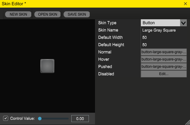
Normal: the image to use when the button is enabled and the user isn’t interacting with it.
Hover: the image to use when the mouse is hovering over the button.
Pushed: the image to use when the user has clicked on the button.
Disabled: used when the button is disabled. To enable or disable a control, simply call SetEnabled(boolean);